Setting Up Your Painting Palette For Watercolor (A Beginner's Guide)
As an avid watercolor artist, I’ve been through the journey of setting up my painting palette and have learned a few tips along the way. Through this blog post, I want to share what I’ve learned with those who are just starting out in watercolors. From picking your paints to choosing the right palette for mixing and storing them, there are several considerations that will help you get started.
If you're new here, hi! I'm Rainbow. I'm a watercolor artist based in Hong Kong. I write about my painting process, share tips for beginners and all things watercolor on this blog. You can also browse my available original paintings and art prints on this website.

I'll explain this in the following parts. Feel free to skip to what is most relevant to you.
Part 1: Picking your paints (What specific colors should you choose, and how many of them)
Part 2: Picking your palette for mixing and storing paints (What are the best palettes for different purposes)

Important things to consider:
Before we begin our journey of setting up our own watercolor painting palette. It is important to consider the following, this will help you in your decision making process and what paints and palettes would be best for you.
For studio work or for travelling?
First off, you need to decide whether you'll be using your paints and palettes for studio work or if you'll be traveling with them. Will you need something that's compact and easy to carry around, or can you afford to use larger palettes with a wider range of colors?
What are your goals in painting?
Another important factor to consider is your goals in painting. Are you looking to learn the fundamentals of color mixing, in which case a limited palette would be better as it pushes us to train those skills. Or are you already experienced in this area and looking to expand your range of colors? Have a think about where you stand on these two points and keep them in mind as you read on.

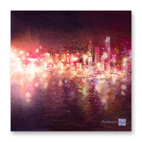
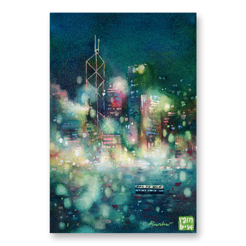
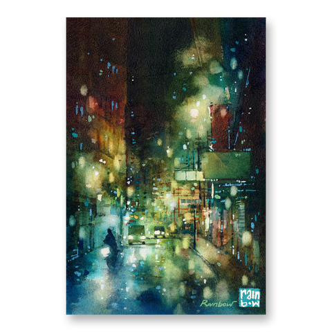
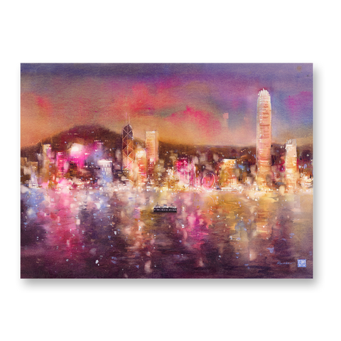
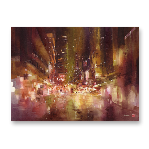
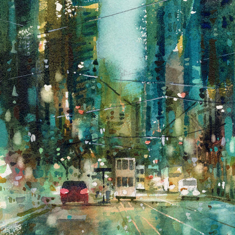
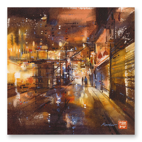
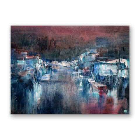
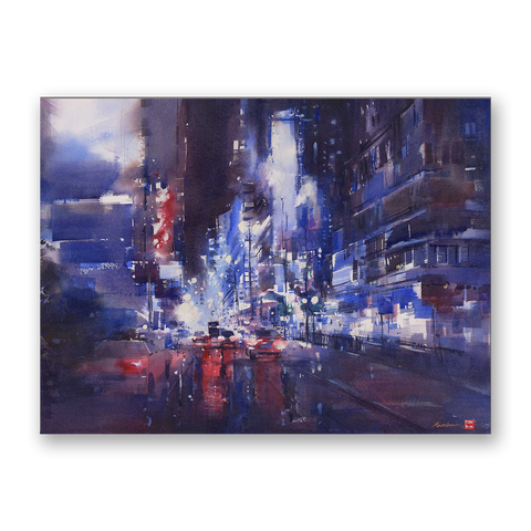
Watercolor on Paper, by RAINB.W
Part 1: Picking your paints
How many watercolors do you really need?
Although it can be tempting to collect and buy many colors and paints (I know the feeling when you walk into an art store and see all the paints lined up...), sometimes a smaller, well-chosen selection can often yield better results. Opting for a limited color palette allows you to develop a deeper understanding of the pigments you're working with and encourages you to experiment with color mixing. From my experience, it is also much easier to create harmony in a painting this way.
My standard studio palette has around 14 colors that I constantly use and refill, this pretty much allows me to paint and create any paintings. I make an exception to have some special colors (granulating paints for interesting textures, iridescent colors, super vibrant hues) but these would be used occasionally.

*Some of the links in this post are affiliate links. I earn from qualifying purchases, at no additional cost to you. I only feature products that I use and truly love.
Watercolor paints in my main palette: Scarlet Lake (link); Quinacridone Scarlet (link); Quinacridone Gold (link); Sap Green (link); Olive Green (link); Cobalt Blue (link); Cobalt Turquoise Light (link); Ultramarine Light (link); Ultramarine Deep (link); Verditer Blue (link); Permanent Violet (link); Lavender (link); Opera (link); Burnt Umber (link).

If I were to reduce this selection to an even smaller number of colors for travelling, this is what my most minimal palette would look like: Scarlet Lake (link); Quinacridone Gold (link); Ultramarine Deep (link); Burnt Umber (link).
Now these are my personal picks, based on my own needs and style in painting. Your selection may be different. But what I wanted to show you here is that you can make do with a limited number of colors.

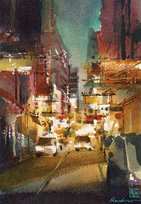
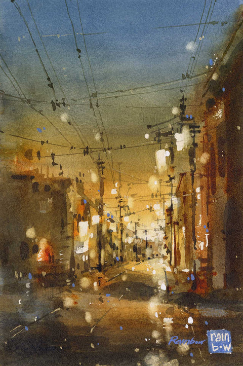
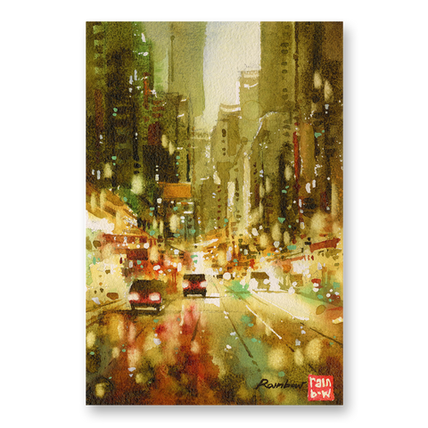
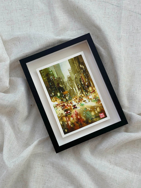
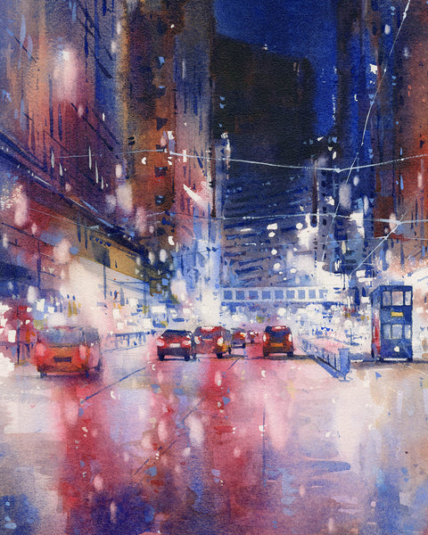
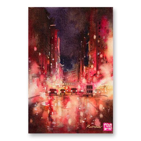
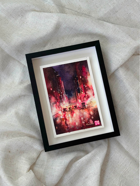
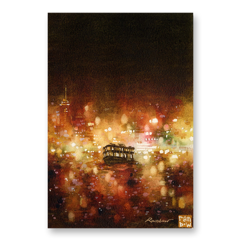
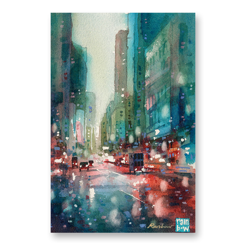
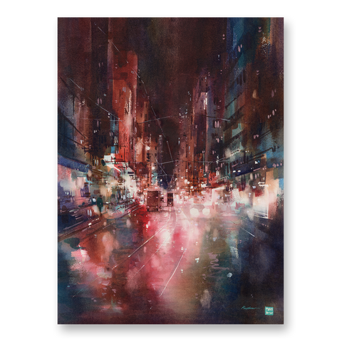
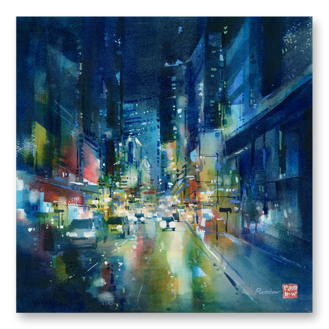
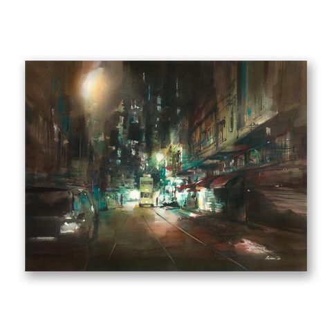
Western District by RAINB.W, Watercolor on paper.
This is a painting I painted with only Scarlet Lake (link); Quinacridone Gold (link); Ultramarine Deep (link); Burnt Umber (link).

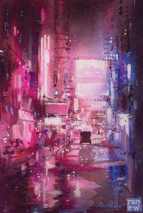
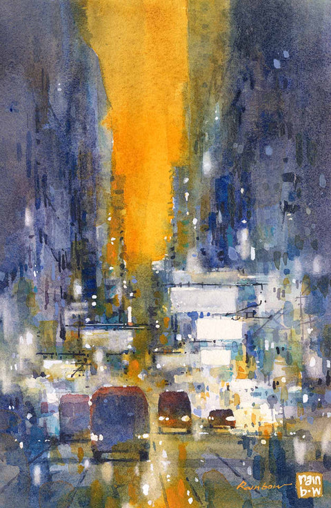
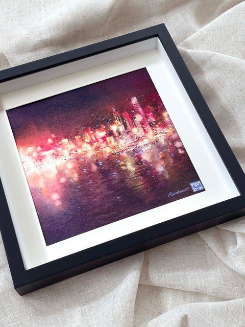
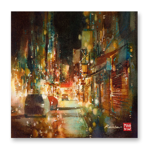
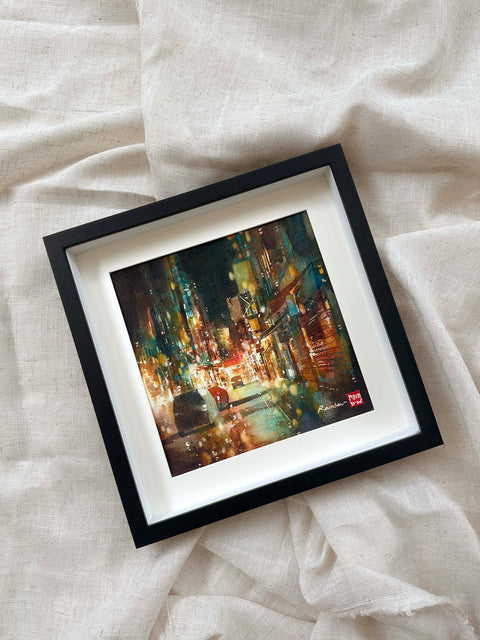
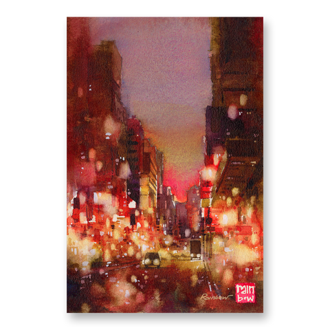
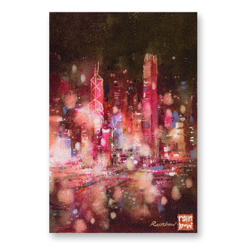
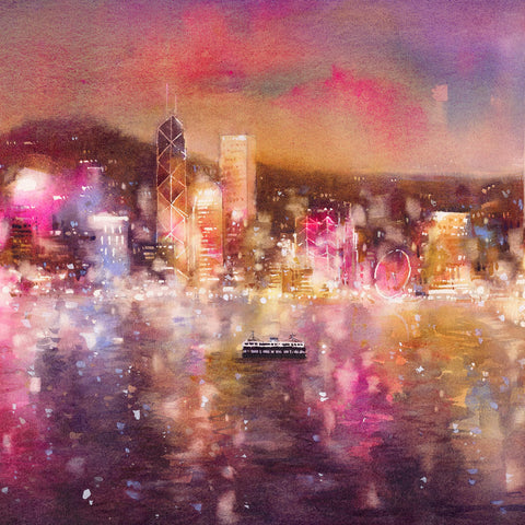
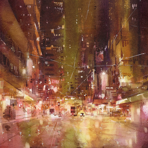
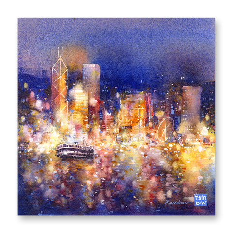
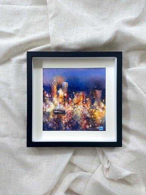
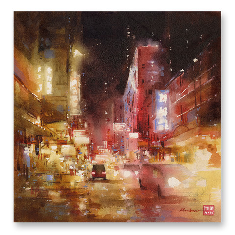
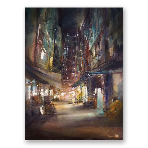
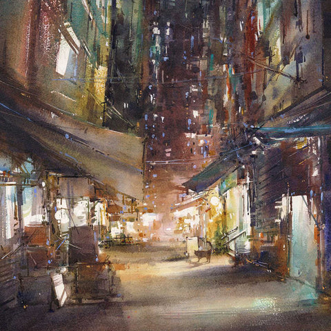
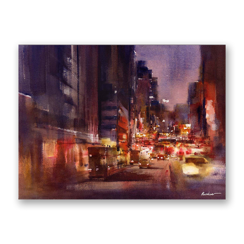
Neon City by RAINB.W, Watercolor on paper.
This is a painting I painted with only Cascade Green (link), and Aussie Red Gold (link).
So how do you pick the colors that are right for YOU? More on that below.
Understanding color mixing
Color mixing is a fundamental skill in watercolor painting. By understanding how different pigments interact with each other, you can expand your palette exponentially. Some colors blend effortlessly to create smooth transitions, while others may produce unexpected results when combined. Experimenting with various combinations is key to developing a feel for color mixing and discovering the unique characteristics of your chosen pigments. Take note of how warm colors and cool colors interact, how complementary colors create vibrant contrasts, and how different intensities of pigments affect the overall mood of your artwork.
The primary colors and secondary colors
The primary colors, traditionally red, blue, and yellow, are the building blocks of all other colors. These hues cannot be created by mixing other pigments together (ie the secondary colors, green, orange, purple). In theory, we can mix all the colors we need simply with just the red yellow and blue paint (plus black and white). But because the physical paints are often not "perfect primary colors" we usually need a few more to help us create the full spectrum of colors. When learning how to color mix or thinking about what to include in your paint palette, I recommend getting a warmer and cooler tone of each primary color:
Warm red: Scarlet Lake (link); Cadmium Red (link)
Cool red: Alizarin Crimson; Quinacridone Scarlet (link)
Warm yellow: Quinacridone Gold (link), Cadmium Yellow
Cool yellow: Lemon Yellow (link)
Warm blue: Ultramarine Deep (link)
Cool blue: Cobalt Blue (link); Prussian Blue (link)
Transparent and opaque colors mix differently
Another important aspect to consider when choosing watercolors for your palette, is the paint's transparency or opacity. If you look at the labels on your watercolor paint, you will find that they usually have a little symbol and text describing the colors' opacity. (This is usually also on the brand's color chart.)
Here are some swatches for easy comparison:

You can see a slight difference here but it is not too noticeable when used solo. The main difference is when you MIX with transparent versus opaque colors. Transparent colors usually maintain their saturated hues when mixed, while semi-opaque or opaque paints tend to become more dull and muddy when mixed with other colors. Here's an example:

Both yellows are mixed with a transparent blue. Notice the green on each one - the one on the left is a little brighter, while the one on the right dulls down just a bit.
So which one is better? Well, there is no right or wrong. Sometimes we WANT to mix muddy colors, while other times we want colors to maintain their saturated vibrancy. But this is an important aspect to consider, and I think it is often missed when beginners learn to pick colors for their palette.
Your turn: Setting up your own palette
Setting up your own watercolor palette can be a personal and exciting process. Start by selecting a palette that suits your needs and preferences, whether it's a traditional porcelain palette or a portable travel palette. Consider the number of wells or compartments available and arrange them in a way that makes sense to you. It can be helpful to organize colors based on temperature (warm and cool) or color families. Label each well with the name or code of the watercolor pigment to ensure consistency. As you explore and experiment with different pigments, you may find that your palette evolves and changes over time, reflecting your artistic journey and preferences.
How do you arrange watercolors in a palette?
This depends on your palette's layout. But I usually recommend that you put similar colors together, and that the hues gradually shift as you move across the palette. This is because, very often when painting, our brushes dab and touch the colors adjacent to it (imagine trying to swatch a yellow ochre and getting some prussian blue on the side of your paint brush...) You want to place the colors so that this is least likely to happen.
Now that we have gone over a bit about the process of picking the paints and colors, I'll move on to part 2, how to pick your palette for mixing and storing paints.

Part 2: Picking your palette for mixing and storing paints
The number of paints you want to put in your palette will largely determine the actual palette you choose. But here are a few of my personal favorites, and I'll explain why I like them.
What is the best watercolor palette? - Personal recommendations from a watercolor artist

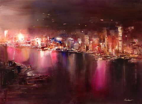
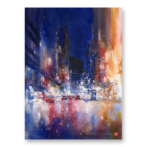
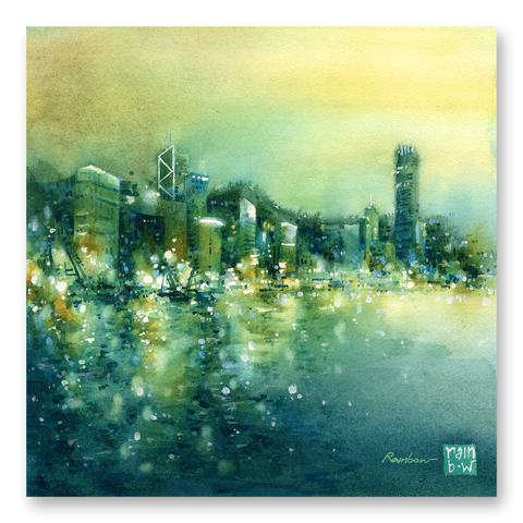
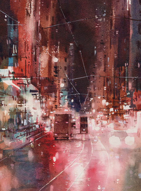
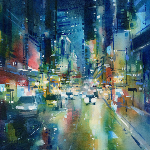
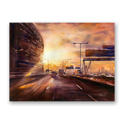
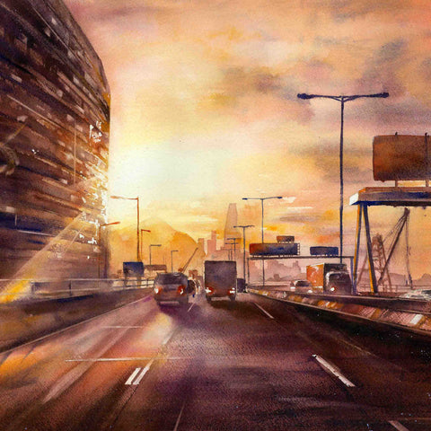
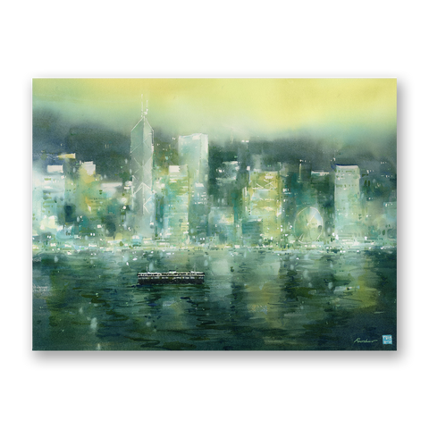
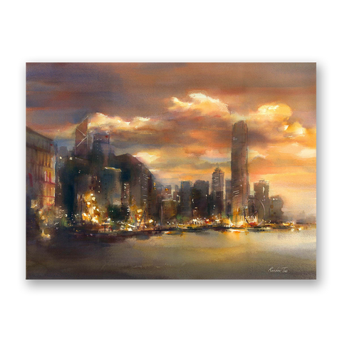
Purple City, Watercolor on paper by RAINB.W
For working in the studio
This is a mixing palette I have used for many years (link). It has one of the smoothest surfaces and I mix colors with ease on it. Its a bit towards the larger side, so I recommend it for studio use over travelling.
My favorite palette is from Mijello (link).
Storing paints separately (so it doesn't dry so quickly)
I actually prefer to store my paints separately. I find that this way, my paints don't dry as quickly, and I don't have to squeeze out new fresh paint every single time. Having this compact little container also means that I can choose to use a bigger or smaller mixing palette along with it depending on whether I am in the studio or out travelling.

Airtight Palette Box (link)
Best compact palette for travelling
Sometimes we want something even more compact. Here are a few options:
Medium sized palette with a decent number of slots for paint colors (link).
Tiny travel sized palette that is minimal and compact (link).

I hope this was a helpful blog post. If you enjoyed reading this, I have share more insights into my painting journey via my email newsletters.
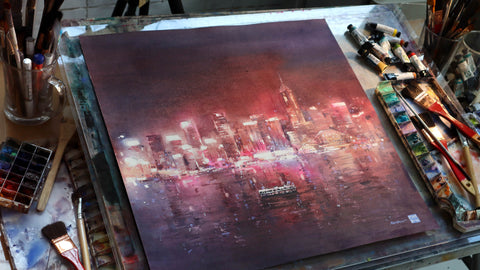
Night Cityscapes in Watercolor (Online Class)

Meet the artist:
Hey! I'm Rainbow.
I am an artist based in Hong Kong. Among the various mediums with which I have worked, I found particular interest in the art of watercolor early on. I appreciated its fluid, flowing properties - it had a life of its own. The process of painting was like a dance with water; I was drawn to the movement of this medium, one that can never be fully controlled yet is wholly beautiful in its nature.
Over the years, I have created a number of series and collections exploring light and color in depicting environments and spaces. Painting has become the medium through which I ventured to see the world around me with wonder; to see the world in all its glorious beauty and serenity, with awe. In the last decade, I have been fortunate enough to share my work with others through exhibitions and workshops locally and internationally. I am honored to be sharing about my art with you here.
Here's where you can find more information about me and my work:
A look inside my painting process: On youtube
Learn to paint cityscapes with me: In my online class
Find my available original paintings: On my website
Find my art prints: On my website
Glimpses into my art practice: On instagram
Original Paintings and Art Prints by RAINB.W


Here's where you can find more information about me and my work:
A look inside my painting process: On youtube
Learn to paint cityscapes with me: In my online class
Find my available original paintings: On my website
Find my art prints: On my website
Glimpses into my art practice: On instagram
Read More on the Blog: